

Welcome to the Dayspring Academy Brand.
We are the top-performing public charter school in Tampa Bay and a leader in education innovation.
We are Dayspring Academy.

Note from the CEO
Welcome to the Brand Guidelines for Dayspring Academy! Dayspring is a beacon of excellence in education and a leader in academic innovation. We are the top-performing public charter school in our region, and we are growing quickly.
A cohesive brand identity has an enormous impact on shaping perceptions, building trust, and fostering a sense of belonging in our community. We created these guidelines to serve as a compass for all stakeholders in maintaining the integrity of our brand across diverse platforms and contexts.
While we celebrate the unique identity of each academy in our network, we also recognize the importance of maintaining a consistent brand presence that unites us under our shared mission. These guidelines provide a framework for consistency that reinforces our identity as a unified institution of learning and innovation.
Thank you for your commitment to upholding the spirit of our brand and for your dedication to the success of every learner in the Dayspring Academy community.
R. Suzanne Legg
CEO, Dayspring Academy
Brand Identity
At Dayspring Academy, our brand identity is a reflection of our core values, guiding principles, and unwavering commitment to excellence in education. As we cultivate a learning environment that embodies our core values, our brand serves as a beacon of inspiration and aspiration for our entire community.
Integrity is woven into the fabric of our brand identity, guiding every aspect of our school's culture, policies, and practices. We uphold the highest standards of ethical conduct, honesty, and accountability in all that we do, fostering a culture of trust and respect in our school community. We instill in our learners the importance of integrity as a fundamental value that shapes their character, informs decisions, and guides actions inside and outside the classroom. By modeling and promoting integrity in all interactions, we cultivate a culture of ethical leadership and responsible citizenship that prepares our learners to make positive contributions to society.
Excellence is not just a goal; it is the standard by which we measure ourselves and our achievements. We strive for excellence in everything we do, from academic performance to learner support services to community engagement initiatives. We set high expectations for ourselves and our learners, challenging them to aim for nothing less than their personal best. Through a relentless pursuit of excellence in teaching, learning, and leadership, we foster a culture of continuous improvement and growth that empowers our learners to excel academically, personally, and professionally.
Innovation is at the heart of our brand identity and drives us to continually push the boundaries of traditional education. We embrace new ideas, technologies, and methodologies to create dynamic learning systems that challenge, engage, and empower our learners. Whether through curriculum design, teaching methods, or school administration, we strive to cultivate a culture of creativity, curiosity, and forward-thinking innovation that prepares our learners for the challenges and opportunities of the future.
Wisdom is knowledge in action. A cornerstone of our brand identity is our unwavering commitment to preparing our learners for success in college and beyond. We remain attuned to the state of education in our community, country, and world, and we lead with intention so our learners are prepared to face whatever comes their way after graduation. Through our innovative Early College program, we empower our learners to realize their full potential and achieve their academic and professional aspirations by getting a head start on their college education.
In essence, our brand identity is a reflection of our commitment to integrity, innovation, excellence, and wisdom—a commitment that shapes every aspect of our school's culture, programs, and practices. As we strive to uphold these values, we remain steadfast in our mission to inspire, empower, and transform the lives of our learners, preparing them to succeed in college, career, and life.
Logo
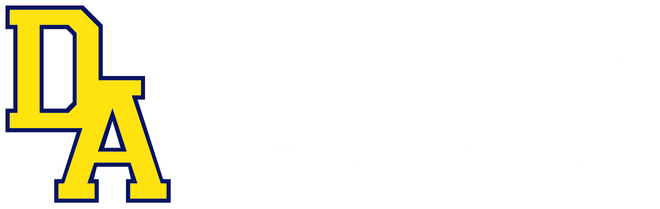
The Dayspring Academy primary logo features the brand’s signature mark, the DA Lockup, and the name of the institution separated by a vertical divider. In freeing the DA Lockup from the rest of the seal design, we allow that simple mark to carry the weight of the Dayspring brand.
Primary Logo

Stacked Logo


Logo Usage
When possible, the logo should be placed on dark backgrounds, as the white stroke outline ensures visibility and legibility. The white stroke outline on the DA Lockup is recognizable as part of the logo, and it does not show up as well on lighter backgrounds.
When using the Dayspring logo, please adhere to the following guidelines:
Maintain clear space around the logo to ensure visibility and impact.
Do not alter the proportions, colors, or elements of the logo in any way.
Use high-resolution versions of the logo to ensure crispness and clarity in all applications.
If resizing the logo, do so proportionally to avoid distortion.
Logo Extensions
The Dayspring Academy logo may not be altered or added to, except in approved formats. Examples of approved formats are below. Any other intended alteration must be approved by Marketing.
Dayspring Seal
Please note that the Dayspring Seal should not be used without the permission of the central office. When used, the Seal should be prominently featured with full opacity and nothing covering it.
Brand Colors
The color palette of Dayspring Academy is designed to reflect our vibrant brand identity while maintaining consistency across all campuses. Our primary brand colors are Blue and Yellow, symbolizing Integrity and Excellence.
In addition to our brand colors, we have a Neutral Colors palette and a Playground Colors palette. While stakeholders are encouraged to incorporate the Neutral and Playground colors into branding materials, we must prioritize the use of the Blue and Yellow brand colors to ensure alignment with the overarching brand identity. By adhering to these color guidelines, we can all maintain consistency with the Dayspring Academy brand while infusing unique designs into our communications and visual materials.
Brand Colors

Neutral Colors

Playground Colors

Brand Typography
The typography of Dayspring Academy plays a crucial role in conveying our brand's identity and values. We have carefully selected two fonts to ensure consistency and readability across all brand materials.
Headline Font: Libre Baskerville. Libre Baskerville is our headline font, used prominently in our logo for the school's name. Its classic serif design evokes a sense of tradition and sophistication while maintaining modern appeal.
Body Font: Open Sans. Open Sans serves as our secondary font, utilized for sub-headlines and body text. With its clean and contemporary sans-serif design, Open Sans enhances readability and complements the Libre Baskerville serif.
By consistently using Libre Baskerville and Open Sans , we ensure visual cohesion and readability across all brand communications. This thoughtful approach to typography reflects our commitment to professionalism, clarity, and excellence in all aspects of our branding efforts.

Typography Usage
Avoid using ALL CAPS in copy and headlines. Instead emphasize text with bolded weight or brand color.
In headlines, use Title Case for capitalization. This means capitalizing the first letter of all words except minor words (typically articles, short prepositions, and conjunctions).
In sub-headlines, use Sentence Case, capitalizing only the first letter of the sentence and the first letter of proper nouns.
Body text should be black on a light background or white on a dark background, unless using a brand color to draw attention to certain words or phrases. We want to avoid too many different colors in our text.
Headline text may be black/Dayspring Blue on a light background or white/Dayspring Yellow on a dark background to help it stand out.
Text should be left aligned, unless there is a design-based need for center, right, or justified alignment. These situations should be relatively rare. Left justification presents most professionally across the widest set of circumstances.
Language Guidance
To promote clear communication and understanding of the structure of Dayspring Academy, we must be consistent in how we refer to the various parts of the organization.
This guidance provides a framework for four key parts of the organization and can be used internally and externally to establish that clarity and consistency.

Organization
When referring to the institution, we prioritize the highest-level brand name Dayspring Academy unless a more specific designation is necessary for the audience or message. This means leaving out signifiers like learning stage or location name, unless they are essential to the message.
Notes:
Should always be used in it’s complete form (not just “Dayspring”)
Should never be separated (e.g.“Dayspring _________ Academy”)
Learning Stages
Learning Stages are the Dayspring Academy version of elementary, middle, and high school. These stages help us communicate that there is something different about the educational path within Dayspring Academy.
We have four learning stages: Early Learning, Elementary Learning, Early College Prep, and Early College. To designate a particular learning stage, use the Learning Stage name in conjunction with the brand name, such as “[Learning Stage] at Dayspring Academy” or “At Dayspring Academy, [Learning Stage] is…” If the brand name has already been mentioned or appears prominently elsewhere in a design, it is okay to use the learning stage name by itself.
Notes:
Must be used in conjunction with “Dayspring Academy” when first used in written communications
Can be appended to the organization name (e.g. “Dayspring Academy Early College”)
Can be used before organization name (e.g. “Elementary Learning at Dayspring Academy”)
Locations
Locations are the physical footprints of Dayspring Academy in the community. We have six locations: Angeline, Harmony, Jazz, Minuet, Ovation, and Symphony. If the brand name has already been mentioned or appears prominently elsewhere in a design, it is okay to use the location name by itself. As a rule, location names should be used only when necessary to refer to a specific school location.
In the case of Early College Prep and Early College, these terms can be used in place of Symphony and Ovation, respectively, since they are the only locations to host those learning stages.
Notes:
Must be used in conjunction with “Dayspring Academy” when first used in written communications (e.g. “Dayspring Academy Angeline location”)
Can be used individually after brand name has been included (e.g. “Dayspring Academy is hosting a meet & greet at the Symphony location. Symphony is nestled in the heart of Port Richey.”
Schools
Schools are the sub-organizations of Dayspring Academy that typically represent a single learning stage at a particular location. Most parents and learners interact with Dayspring Academy at the school level, so providing a consistent experience across the organization is important.
We have six schools within Dayspring Academy:
Dayspring’s Little Scholars at Angeline (Shorthand: “Little Scholars” or “Little Scholars Angeline”)
Dayspring’s Little Scholars at Minuet (Shorthand: “Little Scholars” or “Little Scholars Minuet”)
Dayspring Academy Angeline (Shorthand: “Angeline”)
Dayspring Academy Harmony (Shorthand: “Harmony”)
Dayspring Academy Jazz (Shorthand: “Jazz”)
Dayspring Academy Early College Prep (Shorthand: “Early College Prep” or, internally, “Prep”)
Dayspring Academy Early College (Shorthand: “Early College”)
Notes:
School names should be used in their full form the first time they are mentioned. After that, shorthand can be used.